
In this project, we were assigned to choose an indoor or outdoor facility to design a new signage system for. Our group’s chosen facility was the Stanley A. Milner Library in downtown Edmonton. We were inspired by our case study, the Calgary Central library, in which the signage design was a reflection of the library building itself. With the complex geometric architecture of the Milner Library, we designed a system that aims to bring more structure and clarity for visitors and readers. This project was completed in collaboration with Amy Pretorius. My work focused on the visual identity redesign, case study research as well as the directory and map designs.
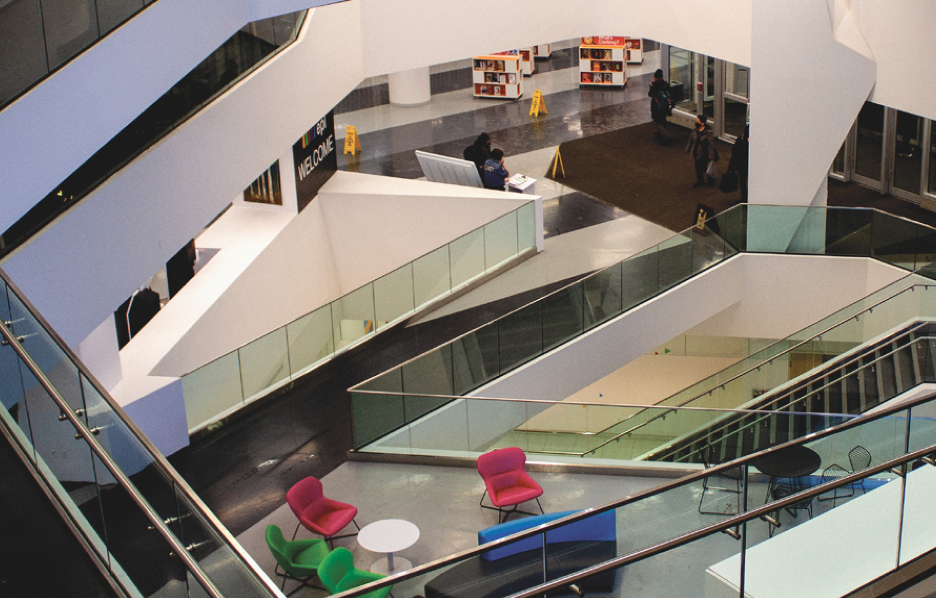
Our research began by exploring the library through the existing signage system. After multiple visits, we understood that our navigation of the library mostly relied on our sense of exploration and wonder, rather than on the direction, identification or orientation signage. The environment of the library is consistently active, with many visitors of all ages, backgrounds and interests. With the many colours and the incessant movement, it becomes much more difficult to find the signage and read the information. On the other hand, the signage system feels a bit disconnected from the library, which may be the reason why most visitors immediately ask for support from staff rather than consulting the signs. All of these design problems have set back the appeal and the functionality of the existing signage system.
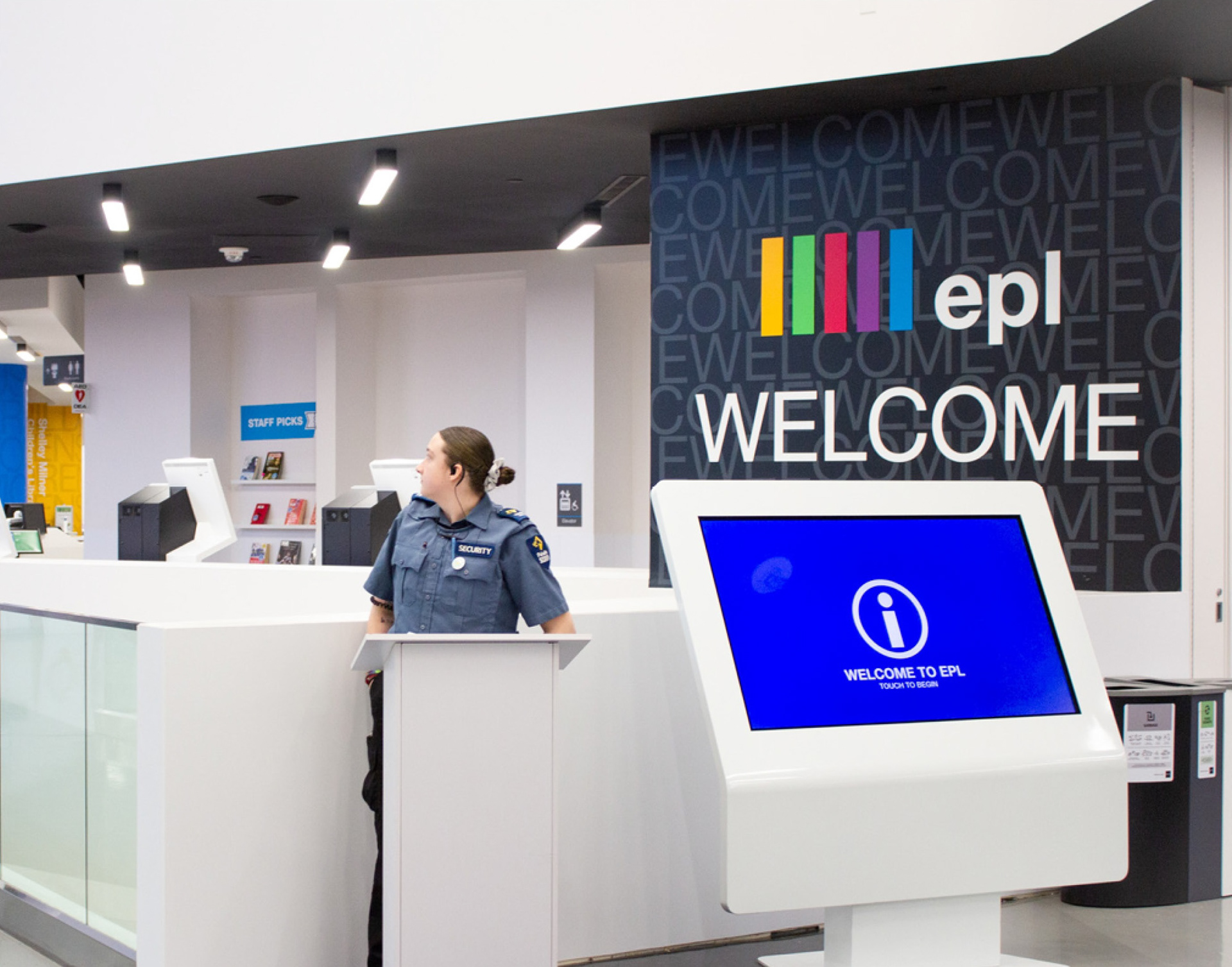
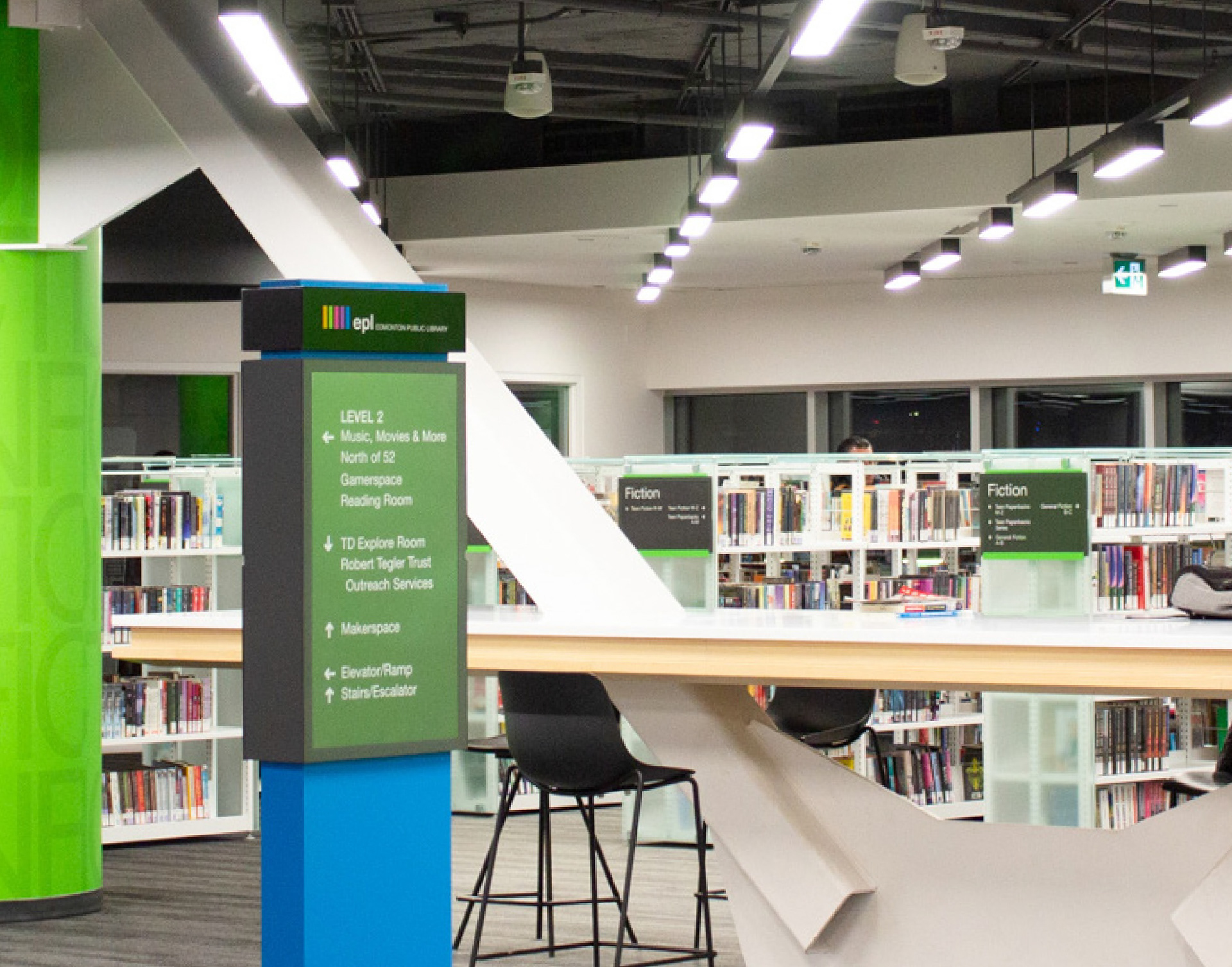
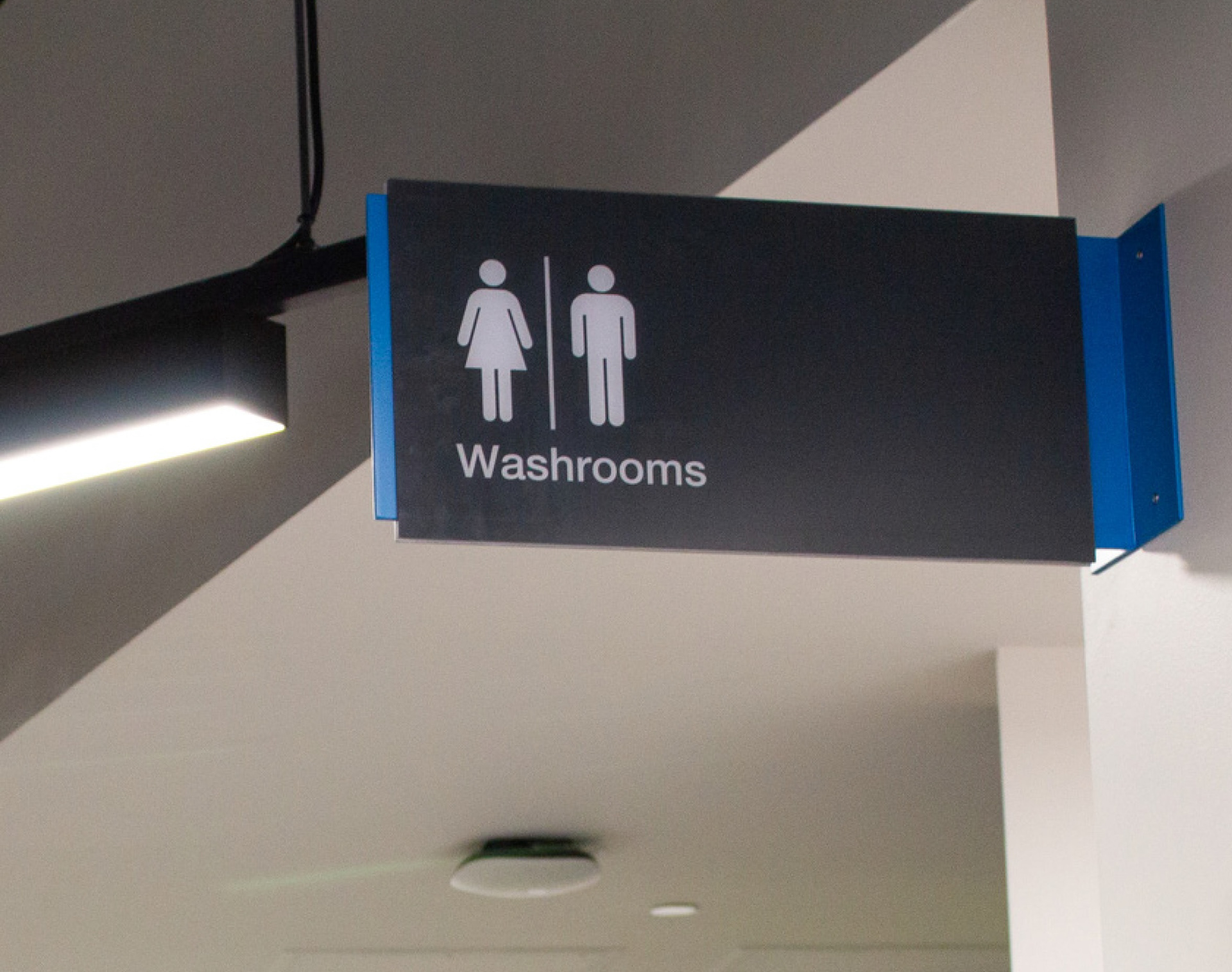
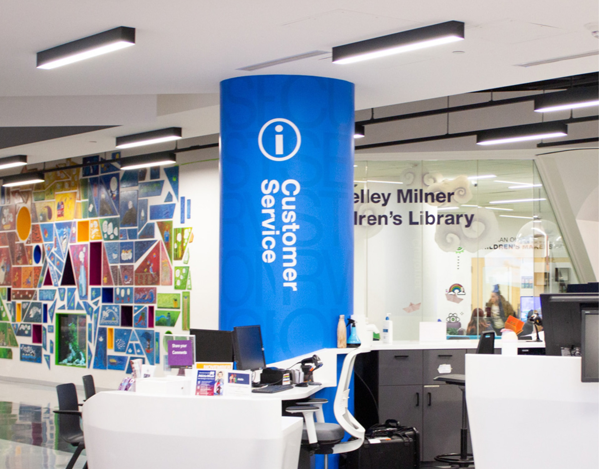
Existing signage on main & second floors. Stanley Milner Library, Downtown Edmonton.
Level Two Directory
While Amy was working on the more direct orientation, identification and regulatory signage designs, my own work focused on the more complex signage including redesigning the second level directory. Despite the presence of a directory on each floor between the two main elevators, the current directory lacks a sense of hierarchy and double-articulation.
In this design, I decided to separate the level numbers from their information text to allow more space around the information, and allow a break to easily find what exists on each level. The colour separation is another important addition for the reader to understand which floor they are located on, and know what is within their reach. As mentioned before, the main five colours in the EPL logotype are reference to the main five book sections. The colours of these book sections are included in this directory based on their location. Symbols are used here as well for easy recognition of different spaces such as the Makerspace or the Printing area. Other detailed information such as the names of non-profit organizations with offices on the 6th floor have been taken out for adaptability and flexibility.
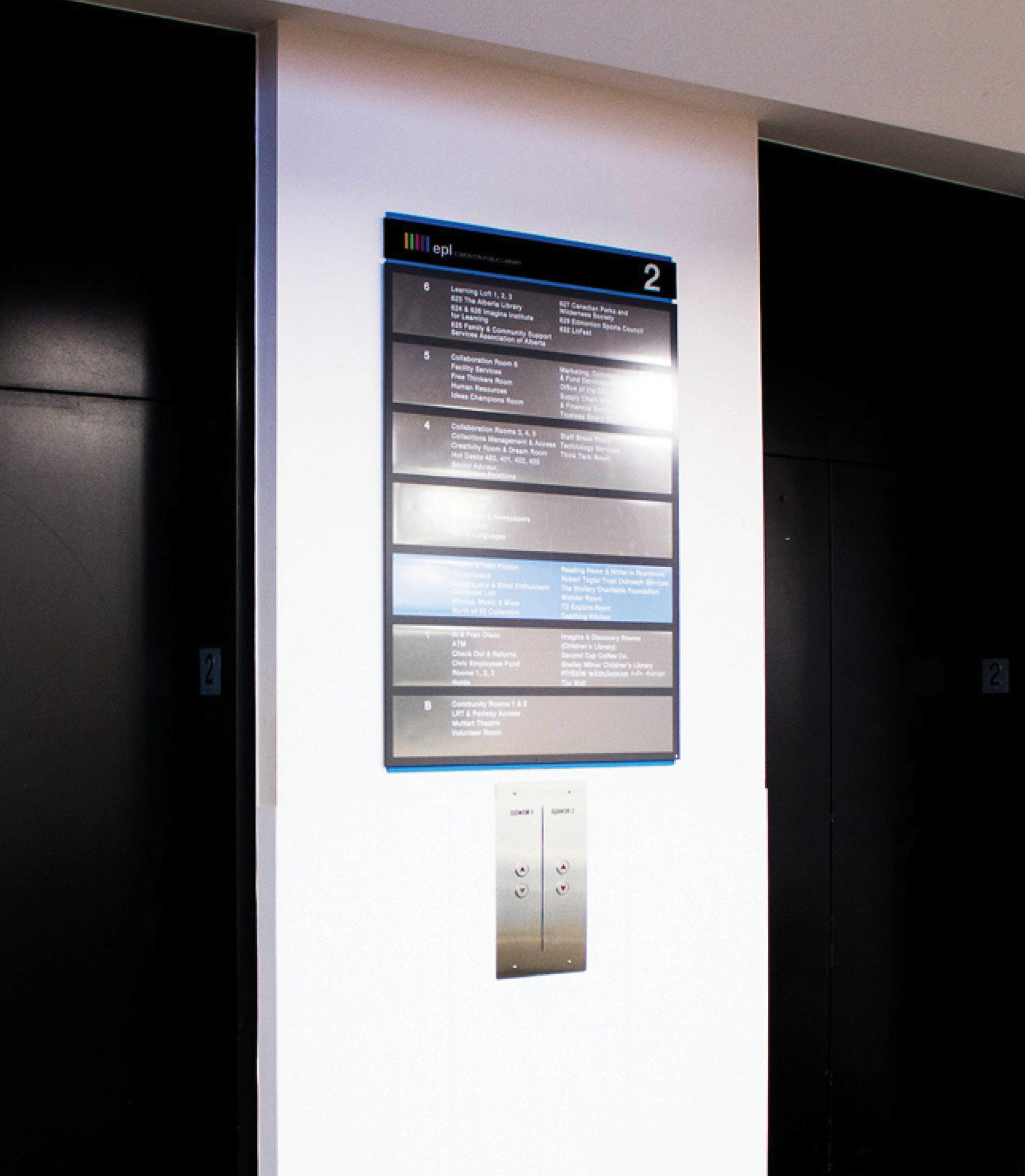
Existing level two directory
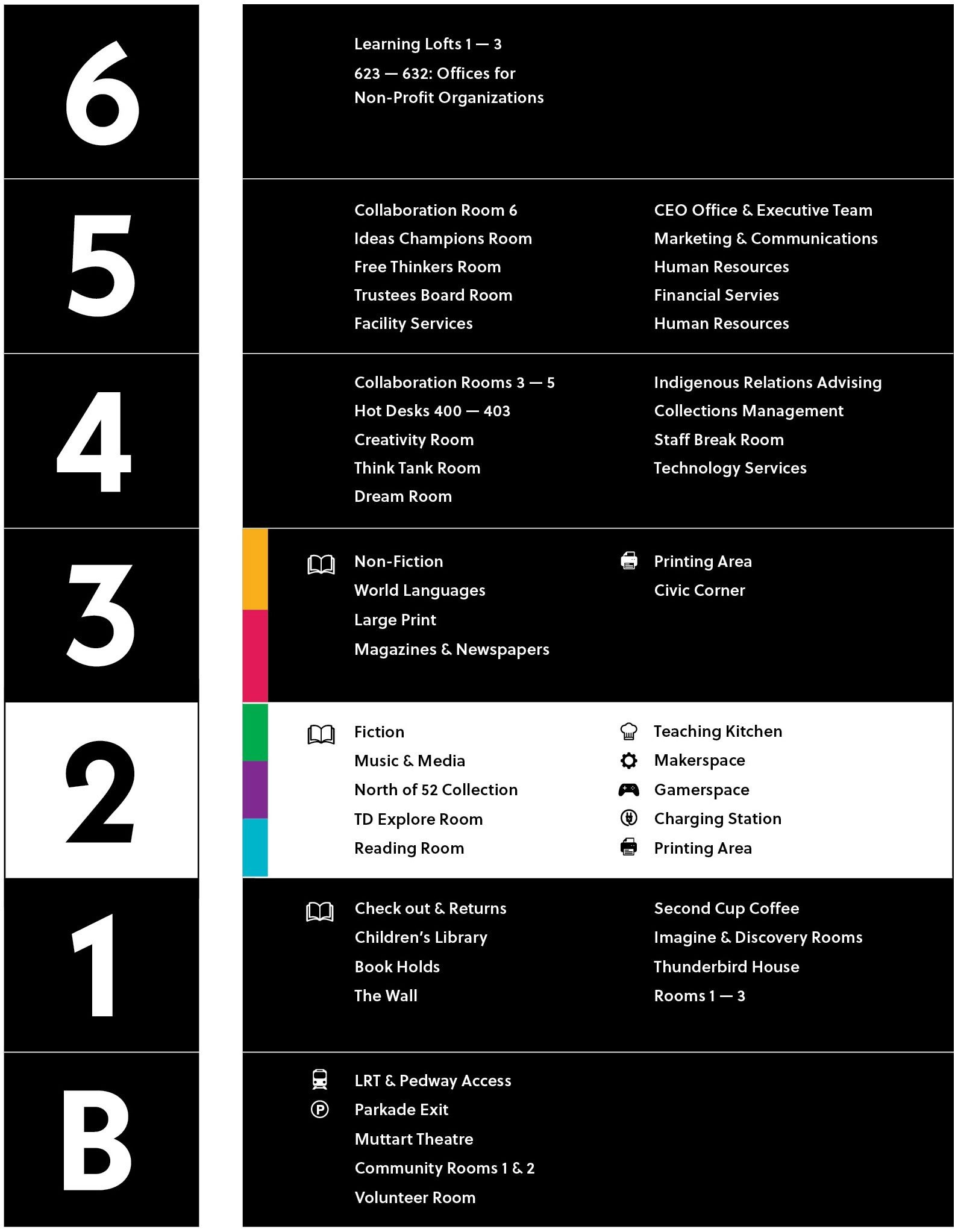
Level two directory redesign
Level Two Map
As we have outlined the many difficulties that we faced in our navigation of the library, it is important to note the absence of a map sign to direct the visitors and identify the locations of the different services or spaces in each level. A map sign became much more essential after we had continued to discover new spaces on each level despite the many visits we made to the library, and after finding out that a visitor's guide with each floor's map is only available by specific request from staff on the customer service desk. The map design, integrated within the new system, is straightforward in displaying the different services on the second level through the use of double-articulation and colour coding. The new map sign would ideally be mounted across from the escalators, and on the wall separating the Makerspace and the Kitchen entrances. In this location, the map sign would be most visible for visitors and would be a clearly found near the Fiction books area highlighted in its colour green.
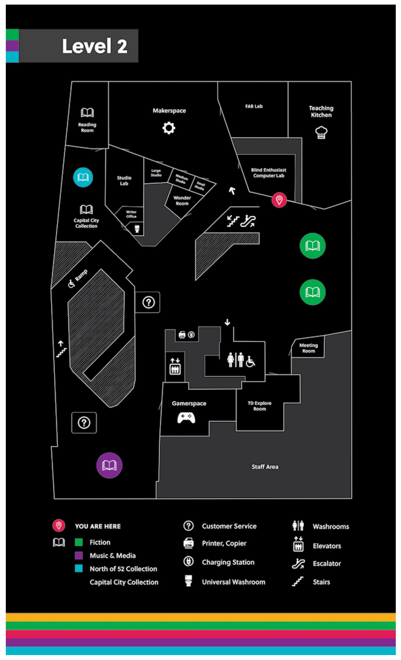
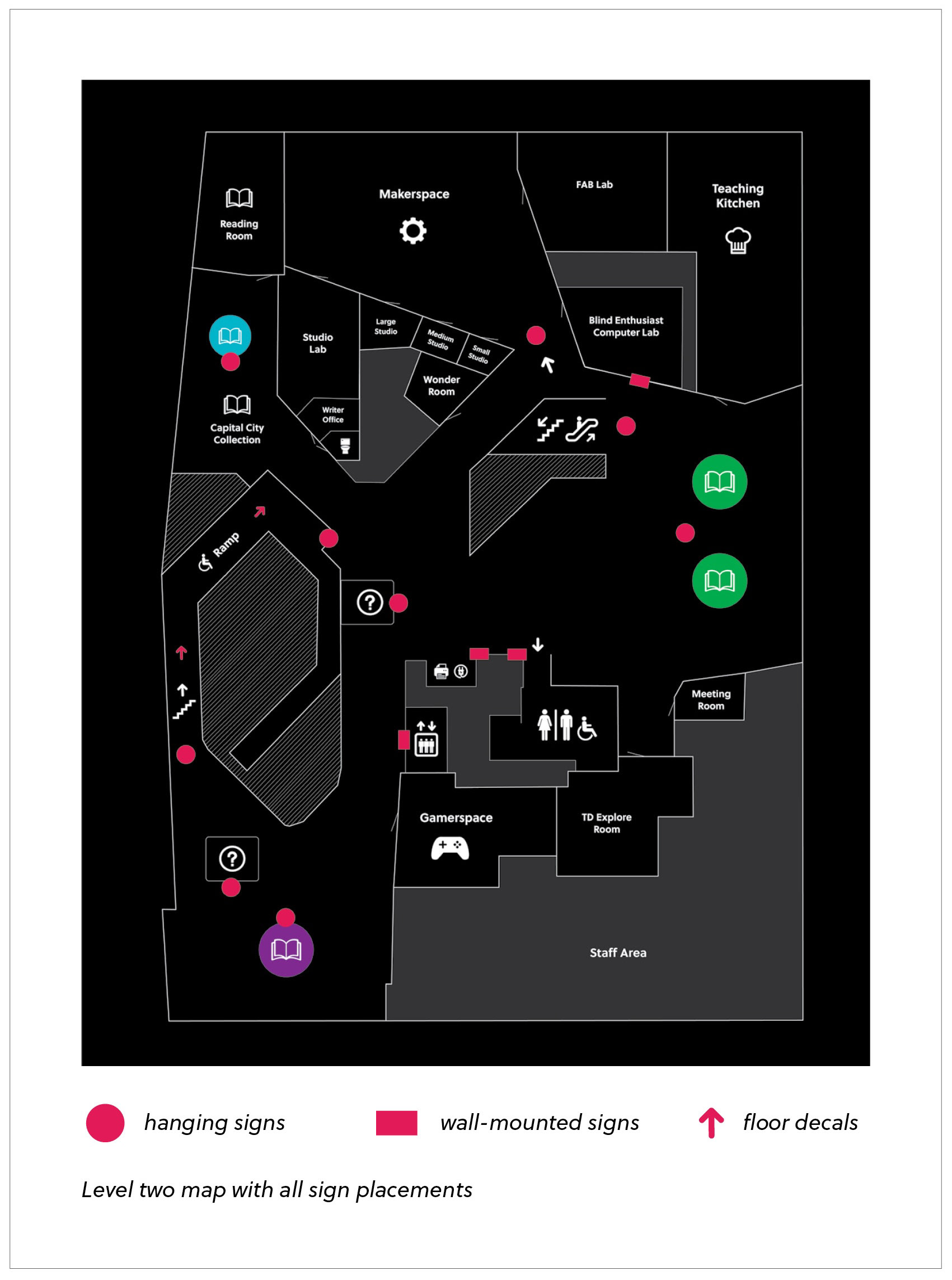
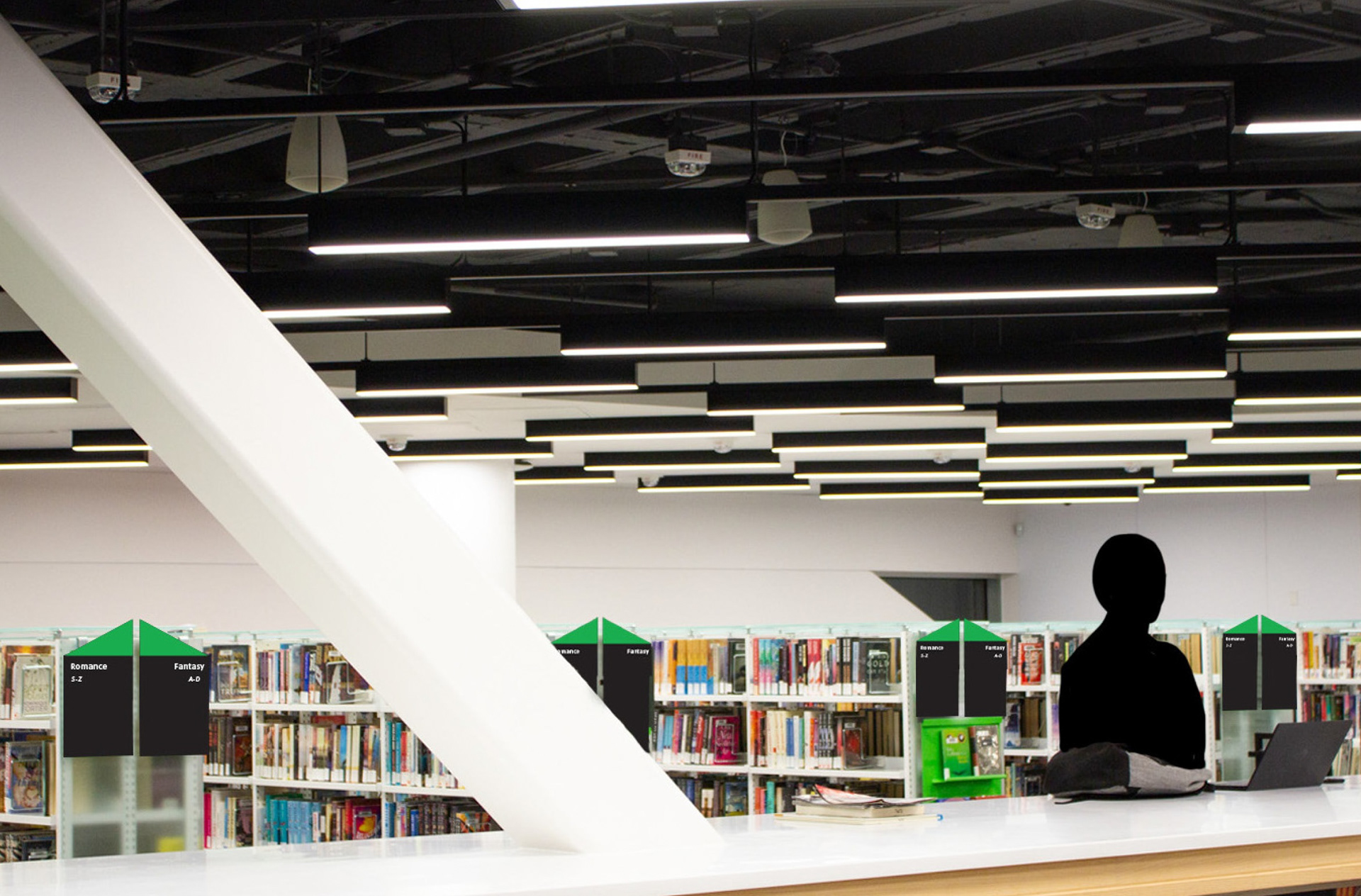
Signage System In-Situ
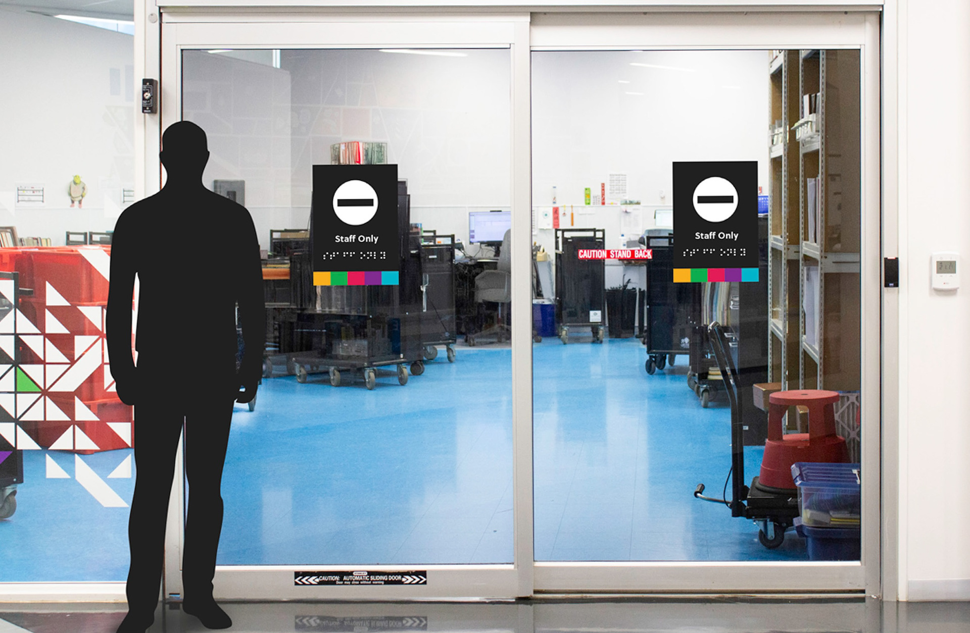
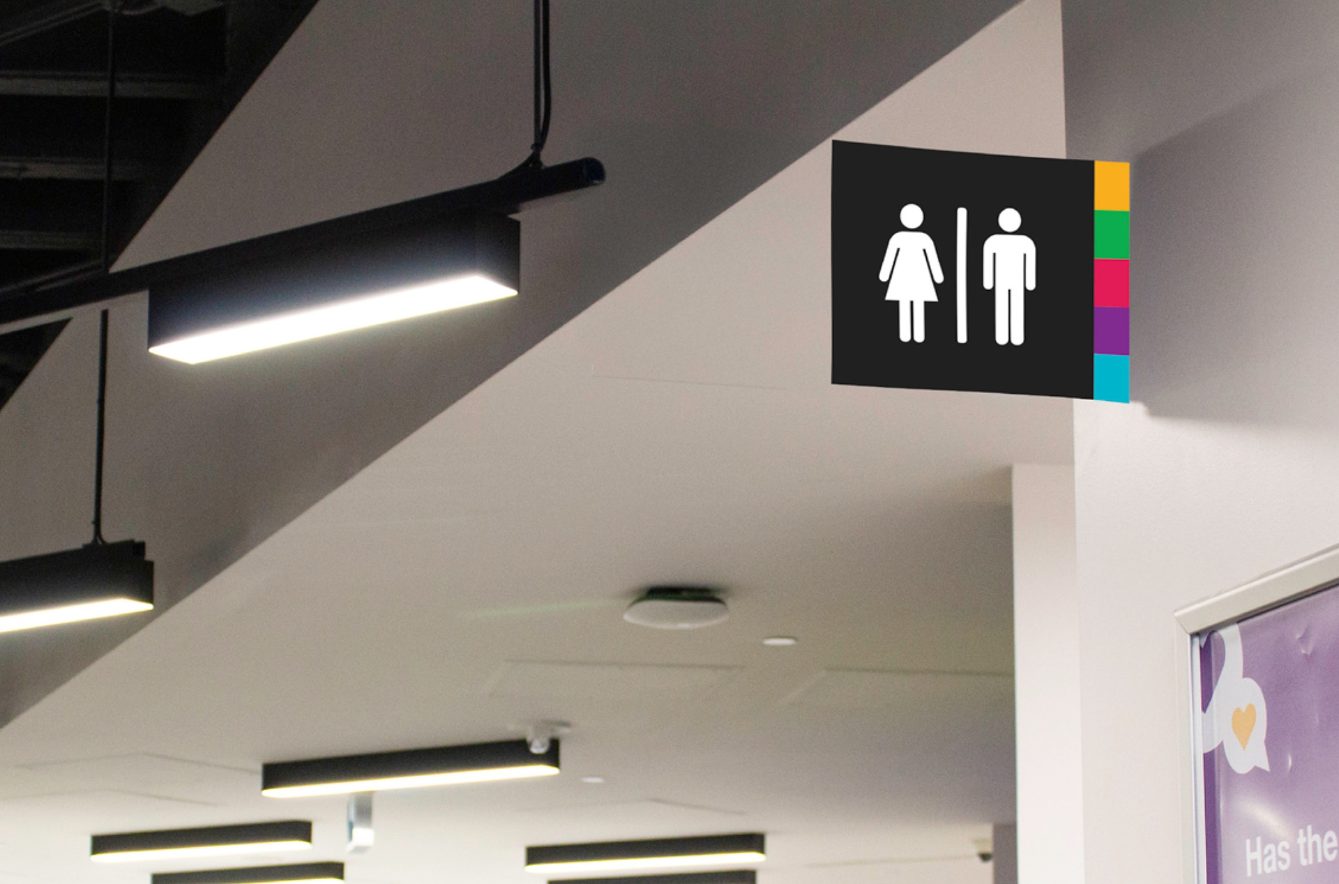
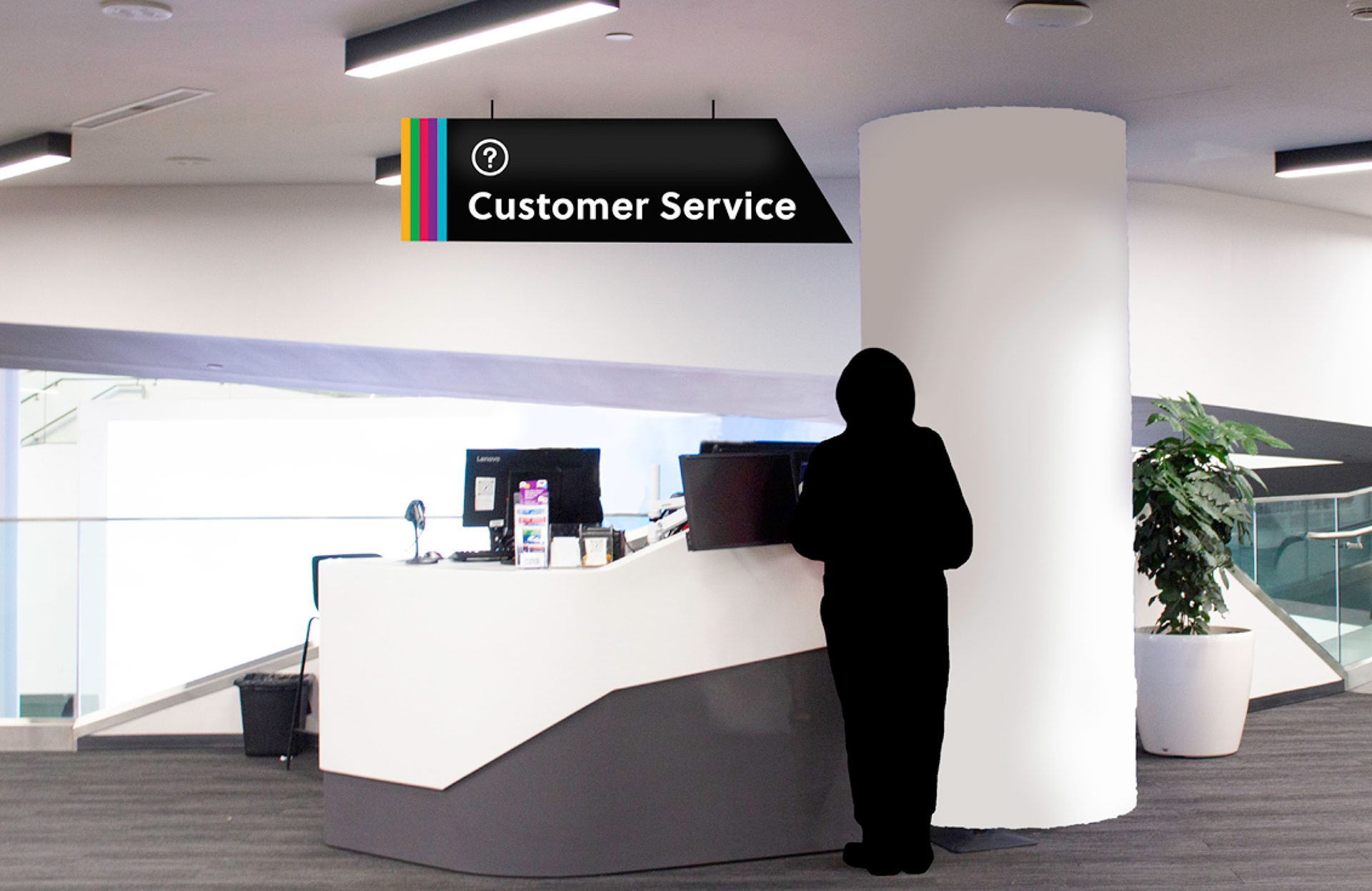
Credits
Amy Pretorius: Orientation signage design, identification signage design, regulatory signage design, construction drawings, in-situ mockups, booklet layout, photography & copywriting.
Mayada Rahal: Visual identity redesign, case study research, symbol design, directory design, map design & sign placement, booklet layout & copywriting.